


Research: This profession is the combinaton of creative and technical solutions that are used to create an enclosed structure.
- This follows a methodical process involving research, analysis, and integration of previous knowledge to meet the needs of the client
-Requires a broad qualifications, but must demonstrate competency when working
- Different specializations of Interior Design include: Bathroom and Kitchen, design for the aged, universal design, multi-family housing, and commercial design.
-Goal: Improve the psychological and physiological state of the client
- The median income for interior designers is about $50 000
- Interior Style ideology is to make a room feel complete and full
- This is often a relatively stressful occupation, as designers must meet contract deadlines, and budget requirements
This also includes plenty of travelling, and will involve a supervisor constantly watching you
-However in more recent years, it is easier to communicate with the client virtually and of course through cell phones, or email. Virtual designs help make the stress of the job easier, as it used to be drawn out and presented to the supervisor and client for approval
- In Canada, there is an Art Institute in Vancouver, and in San Francisco, there is an Academy of the Arts. They both provide general details about the interior design major. It would most likely be a 6 year program. The price is not specified.
Storyboard: The Adventures of a Towel
Here is the story of a towel. This towel's name was towelie. Towelie designed the insides of buildings wondiferously - especially rooms that held towels..
Towelie lived in a very rural area in Colorado where he was the only civilized towel for miles. This was in a small log house which he was building for himself where he designed every single room. An interior designer at heart, it served as a hobby he could not part. He had built the house but had one room that was unfinished - the bathroom. He drew it, he planned it, he built it, but a large pipe had exploded and water shot everywhere - making him spend hours trying to fix it. Eventually Towelie did, and he was able to finish the washroom. His house was finished! He could now relax. He went to his pool which he had also made, and went towel tanning on a chair. He burnt up and turned red as he slept for hours outside in the hot sun.
Nearby, a starving bear opened the door of his small cottage and tore through the house eating everything! It tore down decorations and fancy designs until it tore into the kitchen and ate all the food lying around! Then it tore into the bathroom and drank all its water and wiped its mouth with all the towels in the house!
Towelie had woken up, burnt after a few hours in the sun and then went back in. He was shocked. He was towelified. The scene that lay before him was all too frightening to look at. Towelie cried and cried. All of his beautiful work was tarnished into pieces. With tears dripping down his face, he called his mother - Mother Towel who consoled him and promised to send him a Thinking Hat to help him think of a solution.
A day later, a large hat arrived - a Thinking Hat in fact. Towelie put the coveted hat on and felt visions scream into his head where all of a sudden, he knew what to do.
He started to clean up the mess, and after that he started to draw up some new plans and designs for his house! It would be even better - more functional and pretty than before the disaster occured. Towelie drew up the plans, got new materials and started to rebuild his destroyed home. He spent a complete week to finish, and it looked amazing. New couches, curtains, colours, and chairs; new shapes, sizes, and sitting areas!
When he finished, Towelie went to the poolside - this time knowing that he had done an excellent job fixing his house.
And just then, a bear walked into the house.
Monday, March 22, 2010
Wednesday, January 20, 2010
Unit 2: Body Language
The Emotional Figure
The Boxer by Simon and Garfunkel
I am just a poor boy.
Though my story's seldom told,
I have squandered my resistance
For a pocketful of mumbles,
Such are promises
All lies and jest
Still, a man hears what he wants to hear
And disregards the rest.When I left my home
And my family,I was no more than a boyIn the company of strangers
In the quiet of the railway station,
Running scared,
Laying low,
Seeking out the poorer quarters
Where the ragged people go,Looking for the places
Only they would know.
CHORUS
Lie-la-lie.....Asking only workman's wages I come looking for a job,
But I get no offers.J
ust a come-on from the whores
On Seventh AvenueI do declare,
There were times when I was so lonesomeI took some comfort there.
CHORUS
Then I'm laying out my winter clothes
And wishing I was gone
Going home
Where the New York City winters
Aren't bleeding me,Leading me,Going home.
In the clearing stands a boxer,And a fighter by his tradeAnd he carries the reminders
Of ev'ry glove that laid him down
Or cut him till he cried outIn his anger and his shame,"I am leaving, I am leaving.
"But the fighter still remains
______________________________________________________________
This song carries many inspiring themes such as anger, loneliness, anger, shame, and strenght. It carries the theme to fight and to preservere through all the tough times, and those who do succeed. Heart, Poverty, spirit, and distress are also shone - as represented by the pictures.


__________________________________________________________________


_____________________________________________________________________
The Intended Message:
Through the song The Boxer, it displays themes of fight, sadness, loss and desperation, something that will be reflected within my sculpture. I am choosing to go with the pose of a figure of a homeless person; a metaphor for the image of the boxer who displays sheer will, passion, and determination to go through all the difficult times. A crouching homeless person may display these initial sad feelings through its pose, slouching, hiding his face. The colour of the sculpture may contain dark values as to reflect on the difficult time and setting that the homeless person goes through. The figure will display the first stage of facing the difficult reality through a despondent character, where this person does not know what to do and how to face the problems.
The material used will be wires to create the basic structure, however I plan to use a tattered cloth to resemble the torn clothes of a poor homeless person. The wires will be a group of circles, connected by other wires to form a basic body shape. The cloth may help to show the clothes that the man wears, and its texture will also reflect on the mood of the atmosphere.The message that I intend to give is how everybody is given times of difficulty, times of loss, and that everybody must deal with this universal theme.
The Written Summary
This may have been the most difficult work that I have ever done. The reason? It wa s all completely new or it incorporated work that I haven't done for many years. The soft sculpture that I had created incorporated much of what was needed to qualify it to be a soft sculture, but I had used a wire structure to form a base for my sculpture.
My initial intended message was to display feelings of loss, sadness, and desperation through the body of "The Boxer". However, I would also like to add that I also want to convey another message of loneliness and poverty. The song by Simon and Garfunkel tell a story through the metaphor and literal meaning of a boxer, one who has to fight through the tough times as they experience an abundance of negative feelings. Here, the soft sculpture was made to reflect the first stage of this loss - as the person sulks and can only think about the tragedy that had occured. This seemingly condescending body language exemplifies that morose feeling as the person is crouching in a near fetal position, looking at his or her feet. I feel that I have successfully displayed these emotionss as using the stronger wire to use as a structure helped define the position of the arms, the legs, the torso, and the head.
The Boxer by Simon and Garfunkel
I am just a poor boy.
Though my story's seldom told,
I have squandered my resistance
For a pocketful of mumbles,
Such are promises
All lies and jest
Still, a man hears what he wants to hear
And disregards the rest.When I left my home

And my family,I was no more than a boyIn the company of strangers
In the quiet of the railway station,
Running scared,
Laying low,
Seeking out the poorer quarters
Where the ragged people go,Looking for the places
Only they would know.
CHORUS
Lie-la-lie.....Asking only workman's wages I come looking for a job,
But I get no offers.J
ust a come-on from the whores
On Seventh AvenueI do
 declare,
There were times when I was so lonesomeI took some comfort there.
CHORUS
Then I'm laying out my winter clothes
And wishing I was gone
Going home
Where the New York City winters
Aren't bleeding me,Leading me,Going home.
In the clearing stands a boxer,And a fighter by his tradeAnd he carries the reminders
Of ev'ry glove that laid him down
Or cut him till he cried outIn his anger and his shame,"I am leaving, I am leaving.
"But the fighter still remains
______________________________________________________________
This song carries many inspiring themes such as anger, loneliness, anger, shame, and strenght. It carries the theme to fight and to preservere through all the tough times, and those who do succeed. Heart, Poverty, spirit, and distress are also shone - as represented by the pictures.


__________________________________________________________________


_____________________________________________________________________
The Intended Message:
Through the song The Boxer, it displays themes of fight, sadness, loss and desperation, something that will be reflected within my sculpture. I am choosing to go with the pose of a figure of a homeless person; a metaphor for the image of the boxer who displays sheer will, passion, and determination to go through all the difficult times. A crouching homeless person may display these initial sad feelings through its pose, slouching, hiding his face. The colour of the sculpture may contain dark values as to reflect on the difficult time and setting that the homeless person goes through. The figure will display the first stage of facing the difficult reality through a despondent character, where this person does not know what to do and how to face the problems.
The material used will be wires to create the basic structure, however I plan to use a tattered cloth to resemble the torn clothes of a poor homeless person. The wires will be a group of circles, connected by other wires to form a basic body shape. The cloth may help to show the clothes that the man wears, and its texture will also reflect on the mood of the atmosphere.The message that I intend to give is how everybody is given times of difficulty, times of loss, and that everybody must deal with this universal theme.
The Written Summary
This may have been the most difficult work that I have ever done. The reason? It wa
 s all completely new or it incorporated work that I haven't done for many years. The soft sculpture that I had created incorporated much of what was needed to qualify it to be a soft sculture, but I had used a wire structure to form a base for my sculpture.
My initial intended message was to display feelings of loss, sadness, and desperation through the body of "The Boxer". However, I would also like to add that I also want to convey another message of loneliness and poverty. The song by Simon and Garfunkel tell a story through the metaphor and literal meaning of a boxer, one who has to fight through the tough times as they experience an abundance of negative feelings. Here, the soft sculpture was made to reflect the first stage of this loss - as the person sulks and can only think about the tragedy that had occured. This seemingly condescending body language exemplifies that morose feeling as the person is crouching in a near fetal position, looking at his or her feet. I feel that I have successfully displayed these emotionss as using the stronger wire to use as a structure helped define the position of the arms, the legs, the torso, and the head.

For the project, I have used wires of different gauges, masking tape, glue, cloth, threads of different colours, string, rubber bands, cardboard, plastic, acrylic based paints and water colour paints. As said earlier, I used wire to produce a basic structure. One that would use its shape to generate a body language that screams disappointment and loss. I used masking tape to create a basic skin, that would be covered by cloth. The masking tape, can be viewed as symbolic, as it somewhat resembles a  skin tone that happens to be sticky. Almost as if the boxer (sculpture) had not showered in days - representing the poverty stricken individual. The glue was used to stick on the cloth rags onto the body. It represents the poverty, as if the individual could not buy his own clothes. The cloth was tattered onto the body and seewed onto the arms, legs, and head. It represented a ragged being to show perhaps a loss of income and extreme poverty. Threads had been used to create detail. The facial expression and zipper of the jacket are defined by threads. The threads are messily stiched onto the face to generate a vague view of the individual (particulrly the eyes). That is to show a need for privacy for the individual and to show that it could be anybody experiencing feelings of negativity. String was used to represent a primitive belt for the poverty affected individual. The rubber bands wrap around the feet to represent plastic bag shoes and and help define the image of feet. Cardboard is used to represent the wall the individual is sitting against. The plastic bag
  helps accentuate the economic situation for the individual. Acrylic paint is used to represent a wall as well as concrete. Watercolour is for the individual's clothes.
 skin tone that happens to be sticky. Almost as if the boxer (sculpture) had not showered in days - representing the poverty stricken individual. The glue was used to stick on the cloth rags onto the body. It represents the poverty, as if the individual could not buy his own clothes. The cloth was tattered onto the body and seewed onto the arms, legs, and head. It represented a ragged being to show perhaps a loss of income and extreme poverty. Threads had been used to create detail. The facial expression and zipper of the jacket are defined by threads. The threads are messily stiched onto the face to generate a vague view of the individual (particulrly the eyes). That is to show a need for privacy for the individual and to show that it could be anybody experiencing feelings of negativity. String was used to represent a primitive belt for the poverty affected individual. The rubber bands wrap around the feet to represent plastic bag shoes and and help define the image of feet. Cardboard is used to represent the wall the individual is sitting against. The plastic bag
  helps accentuate the economic situation for the individual. Acrylic paint is used to represent a wall as well as concrete. Watercolour is for the individual's clothes.
 There are positive and negative aspects to my sculpture. My two positive aspects are that I feel that the structure is very good. I also really like that the structure can display an actual pose and that the pose can express some feeling. The structure is sitting and bending slight over as if doubled-up, giving off the feeling that the person is feeling uncertainty and trepidation. A negative aspect to my work may be my detailed work. I find that my cloth arms and legs did not bend and have the most desirable size, shape to them. This had to do with my new experience towards sewing and stuffing in combination with the wire structure. This unforseen challenge had slowed me down significantly trying to find new and better ways to create an outer skin for my soft sculpture.
sewing and stuffing in combination with the wire structure. This unforseen challenge had slowed me down significantly trying to find new and better ways to create an outer skin for my soft sculpture.I began the process with a brainstorming activity and decided to use wires to design my basic structure to give it form, as I believed that to achieve the shape I was looking for would be difficult using only soft sculpture. The wire work was not too difficult, I made circles to represent the 7 head proportion ratio, where there was a new head spacing, I added a circle for support. In between I put supporting wires - usually 3-4 to hold up the sculpture. I added arms and legs, using little circles to represent the sockets. After the wiring was completed, I put tape onto the wire structure surrounding the entire body. The legs, arms, and head were left alone. I then got cloth rectangles, rolled it up and sewed the two ends  together. I got small cylinders that I fit over each arm and leg, which was each divided into 2 segments. This was then stuffed with relatively large amounts of cotton to represent thick layers of clothing. After, I sewed on some fabric onto the head, which was stuffed. The hood covers the head to conceal the head and the open end of the stuffed head. I sew the hood over the front of the head to further conceal facial features. Then I sewed onto the face a set of details, all mostly vague - a set of eyes, nose and mouth. I also sew a line on a rectangular piece of clloth that I attached down the centre of the body to represent a zipper. Then I added a string around the body as well as rubber bands to tie on a plastic bag around the feet. Lastly, came the painting of the background and the body using acrylic and water colour. When testing out the water colour on a small piece of cloth, it was very difficult to use as the cloth tends to repel water. I also had a very limited supply of water-colour paints (which I thought I had plenty of), so I switched to using acrylics for most of the sculpture. I had used water colour on the inside of the hood to create a light shadow, and some on the pants of the sculpture to show faded jeans. However, I mostly used acrylic to do my work painting the rest of the jeans, jacket, and hood. To do this, I had painted over the cloth several times with water to have it absorbed, and then I applied paint. This allowed it to dry with lighter values and allow it to spread out more when it was applied. After, a glue gun was applied to secure the sculpture onto the wooden board and black paint was put onto the back of the wall.
 together. I got small cylinders that I fit over each arm and leg, which was each divided into 2 segments. This was then stuffed with relatively large amounts of cotton to represent thick layers of clothing. After, I sewed on some fabric onto the head, which was stuffed. The hood covers the head to conceal the head and the open end of the stuffed head. I sew the hood over the front of the head to further conceal facial features. Then I sewed onto the face a set of details, all mostly vague - a set of eyes, nose and mouth. I also sew a line on a rectangular piece of clloth that I attached down the centre of the body to represent a zipper. Then I added a string around the body as well as rubber bands to tie on a plastic bag around the feet. Lastly, came the painting of the background and the body using acrylic and water colour. When testing out the water colour on a small piece of cloth, it was very difficult to use as the cloth tends to repel water. I also had a very limited supply of water-colour paints (which I thought I had plenty of), so I switched to using acrylics for most of the sculpture. I had used water colour on the inside of the hood to create a light shadow, and some on the pants of the sculpture to show faded jeans. However, I mostly used acrylic to do my work painting the rest of the jeans, jacket, and hood. To do this, I had painted over the cloth several times with water to have it absorbed, and then I applied paint. This allowed it to dry with lighter values and allow it to spread out more when it was applied. After, a glue gun was applied to secure the sculpture onto the wooden board and black paint was put onto the back of the wall.
Of course, I would display the piece in with the background. This helps accentuate the setting of the piece. However, in terms of lighting I would definately want a light shining over-top the figure to add dark values to the face. This creates shadows that conceal the face, seeemingly adding more feel to the darkness and loneliness that lies beneath the hood. A light behind the cardboard will help too to cast a slight shadow over the figure - again to represent the darkness surrounding the boxer.
Overall, a difficult project that moved very quickly. I thoroughly enjoyed this, as I was able to experience a very exciting new chance to sculpt - something I haven't done in years and to sew - something totally new. It was extremely difficult as everything was relatively new, but quite a fun challenge.
Wednesday, December 9, 2009
Portrait Painting
Unit 1: Self Portrait Painting
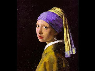
There were a few artists who had helped inspire the work. Van Gogh, Johannes Vermeer, and Dan Lacey(right). Van Gogh's work uses plenty of tiny brush strokes in his artwork, making his self portrait seem like a reflection of himself. I really enjoy this style, not only for its aesthetic beauty, but it also moves your eyes around the picture plane. This served as an influence to how I may create my background, and to perhaps use his style of painting in my work. In the end, I chose to incoroporate some of this short stroke technique, to try to make the impression that I may be in some sort of reflection of water. Vermeer served as a totally different example for my work. Johannes' work is much more fine, and usually is a solid brush stroke, with blending. I could not hope to try to emulate Vermeer's work, (that would require many more years of practice), however I really enjoyed how the face and clothing was done, and how the gradual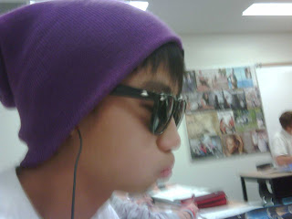 blending really helped to show the shadows on the person. This work encouraged me to blend colours very gradually using a wet-on-wet technique to achieve certain tones. Dan Lacey's work was a large influence for my work. It was very enjoyable, and vague, with a certain degree of randomness(with all of his pancakes), that really made me enjoy his work. His work helped me develop how the colours would interact with each other on my self portrait.
For this acrylic painting, I wanted to exclude the background, and so I initially threw paint randomly onto the board (canvas?), and then I had tried to sketch out the proportions with a pencil over the dried paint. I had realized after applying the background that it may be very difficult to get the correct shapes, since I had troubles with that in my initial sketch (for previous project).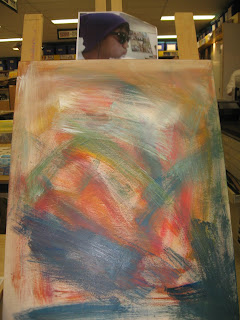 The background was mostly long dry-brush strokes, with the left side lighter, and the right side darker. This was a quick decision, which I had done after noticing how the values on my face were done. I tried to contrast the darker side (my left side of the face with my hat) with lighter values, and the lighter side (right) with darker values.
 that's when shape began to take place and truly show my facial features. For lines, I began to incorporate some brushstrokes into the work to try to show the lines created on my face. The hat was given vertical lines, giving a "potential" movement in the picture, making it seem like it was in action. After this was done, sprialling brush strokes around the cheek were created as well as a dark shadow that went across my mouth, which looked like a beard. I ble
nded some blue into the peach colour, and painted it in, however it proved to be too dark, so gradually each class I would apply a layer of a very wet and thin peach tone to lighten it up.
The portrait painting is the follow up of the self-portrait sketch. Here, I chose a picture portraying me with a hat and sunglasses. The particular picture of myself was chosen for a reason, as it was a unique picture. Many 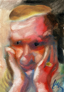 of the self portraits entirely reveal the facial features of the artist. I was looking for a change, where parts of the face may have
 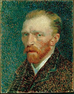 been covered up. The particular picture also contained a very uniquely coloured hat, a bright violet, which greatly contrasted the surroundings of the picture. I imagined that this would really stand out within a painting, and help display the other features of the face.
 of the self portraits entirely reveal the facial features of the artist. I was looking for a change, where parts of the face may have
  been covered up. The particular picture also contained a very uniquely coloured hat, a bright violet, which greatly contrasted the surroundings of the picture. I imagined that this would really stand out within a painting, and help display the other features of the face.
There were a few artists who had helped inspire the work. Van Gogh, Johannes Vermeer, and Dan Lacey(right). Van Gogh's work uses plenty of tiny brush strokes in his artwork, making his self portrait seem like a reflection of himself. I really enjoy this style, not only for its aesthetic beauty, but it also moves your eyes around the picture plane. This served as an influence to how I may create my background, and to perhaps use his style of painting in my work. In the end, I chose to incoroporate some of this short stroke technique, to try to make the impression that I may be in some sort of reflection of water. Vermeer served as a totally different example for my work. Johannes' work is much more fine, and usually is a solid brush stroke, with blending. I could not hope to try to emulate Vermeer's work, (that would require many more years of practice), however I really enjoyed how the face and clothing was done, and how the gradual
 blending really helped to show the shadows on the person. This work encouraged me to blend colours very gradually using a wet-on-wet technique to achieve certain tones. Dan Lacey's work was a large influence for my work. It was very enjoyable, and vague, with a certain degree of randomness(with all of his pancakes), that really made me enjoy his work. His work helped me develop how the colours would interact with each other on my self portrait.
 For this acrylic painting, I wanted to exclude the background, and so I initially threw paint randomly onto the board (canvas?), and then I had tried to sketch out the proportions with a pencil over the dried paint. I had realized after applying the background that it may be very difficult to get the correct shapes, since I had troubles with that in my initial sketch (for previous project).
 The background was mostly long dry-brush strokes, with the left side lighter, and the right side darker. This was a quick decision, which I had done after noticing how the values on my face were done. I tried to contrast the darker side (my left side of the face with my hat) with lighter values, and the lighter side (right) with darker values.
 I was not sure of how I wanted to create my face, although I wanted to create a kind of blurry, blended portrait, like that of Lacey's and Van Gogh's work. For my background, I only planned out how the values may work out, however I did not decide on exactly what I wanted, so I chose to just play around with what I had. There were no very clear intentions on what the mood may be, although I aimed for it to look relatively calm, like many self portraits I have seen.
As the portrait took shape, I was quite a blur, and shapes were not very defined, so I tried to work more in the direction of Vermeer and 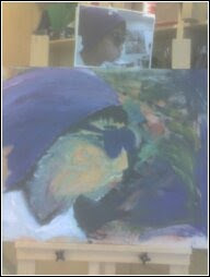 Van Gogh. This seemed to evoke some sense of speed and confusion, and it was interesting, however I wanted a more defined image. Much of the original worked with dry brush strokes that created some background and shape, which then followed by larger 'globs' of paint to fill in the spaces. For the blending of the facial features, I found that applying little paint intially, followed by using a large, wet, clean brush to go over the initial paint really helped to gradually smooth out the features.
On the board, I tried to leave some negative space (showing the board
itself), to try and give some room for the eyes to rest. However, as the project wore on, much of this was covered up (but there is still some left). Now, shape begins to develop, my chin becomes more defined, my nose is pushed out, and lips are drawn up. My glasses really took shape only after Charlie noticed that they were too circular, and that they needed to be lengthened, and
 Van Gogh. This seemed to evoke some sense of speed and confusion, and it was interesting, however I wanted a more defined image. Much of the original worked with dry brush strokes that created some background and shape, which then followed by larger 'globs' of paint to fill in the spaces. For the blending of the facial features, I found that applying little paint intially, followed by using a large, wet, clean brush to go over the initial paint really helped to gradually smooth out the features.
On the board, I tried to leave some negative space (showing the board
itself), to try and give some room for the eyes to rest. However, as the project wore on, much of this was covered up (but there is still some left). Now, shape begins to develop, my chin becomes more defined, my nose is pushed out, and lips are drawn up. My glasses really took shape only after Charlie noticed that they were too circular, and that they needed to be lengthened, and

nded some blue into the peach colour, and painted it in, however it proved to be too dark, so gradually each class I would apply a layer of a very wet and thin peach tone to lighten it up.

For this painting, as I said earlier, had no real idea of exactly where it was going. There was no expression, or message initially planned out, however in my mind I did want a relatively calm, tranquil, yet lively painting. However, I do realize in my mind, as I'm writing this, that as I am working on it, I didn't want something extremely calm, and formal, like portraits of prime ministers. I wanted some action, and some movement on the picture plane. This is reflected by the random background, which serves to move the eye around with its many warm and cool colours in many shapes and directions. The lines on the face reflect many feelings of action, and a sense of confidence and calmness with the glasses. Achieving the feelings of action required movement, and that was done witht the line work, where lines on the background guide your eye from the top of the face to the bottom of the face. Lines in the hat, neck, shirt, and cheek also help provide this movement.
My overall message was to show a relative calmness, while keeping it casual, lively, and imagination. Looking into the background, this was on-the-go, meaning that there was little to no planning involved, and it was supposed to show a degree of randomness, and imagination. The Van Gogh-like short brush stroke technique at the bottom was done to create a feeling of looking into a reflection - for self reflection, thoughts, or thinking. The space-like background serves as the landscape.
The light tones on the face and shirt are equal in terms of quantity with the amount of darker tones in the shadows, hair, and glasses. This seems to even out the mood of the painting, making it neither happy, nor sad, but very neutral with hints of livelyness that seem to come out of the brilliant violet hat and the mixed background. The blues on the shirt give it a wrink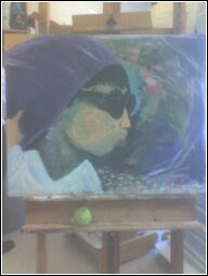 ly feel, almost as if being blown, yet again suggesting feelings of action. The background gives an imaginary feel, as if you could just stare into space and think. The spiral lines in the cheek help evoke this imaginary feel, making it seem like as if it would last an eternity. The left side was left to appear like the wooden panel we used to seem like negative space for the eye to rest. The middle ground, much of it hidden, is behind the face and hat that can be seen. Much of it includes the original colours used to shape out the face, as well as the pencil markings to outline it. The white on the shirt serves as a base colour for the shirt, a light tone, giving the painting an airy, happier feel to it. The face is mostly a light peach, or orange colour that is covered by more layers of peach and/or orange, blue, green, and violet. This light value contributes to the calm, lively message that the painting displays. The foreground consists of things like the hat, the glasses, shadows, and the facial features. The hat displays a bright purple that stands out, showing the lively parts of the painting, while the hair beneath it contrasts it significantly to allow for it to stand out. The shadows on the shirt, neck, and face help show where the light comes from, gives it an almost outdoor feel, which contradicts the "spacey" feeling received from the background- giving the picture a confusing, random feel.
 ly feel, almost as if being blown, yet again suggesting feelings of action. The background gives an imaginary feel, as if you could just stare into space and think. The spiral lines in the cheek help evoke this imaginary feel, making it seem like as if it would last an eternity. The left side was left to appear like the wooden panel we used to seem like negative space for the eye to rest. The middle ground, much of it hidden, is behind the face and hat that can be seen. Much of it includes the original colours used to shape out the face, as well as the pencil markings to outline it. The white on the shirt serves as a base colour for the shirt, a light tone, giving the painting an airy, happier feel to it. The face is mostly a light peach, or orange colour that is covered by more layers of peach and/or orange, blue, green, and violet. This light value contributes to the calm, lively message that the painting displays. The foreground consists of things like the hat, the glasses, shadows, and the facial features. The hat displays a bright purple that stands out, showing the lively parts of the painting, while the hair beneath it contrasts it significantly to allow for it to stand out. The shadows on the shirt, neck, and face help show where the light comes from, gives it an almost outdoor feel, which contradicts the "spacey" feeling received from the background- giving the picture a confusing, random feel.
 This acrylic painting project overall, was not as difficult as the previous sketch. I feel very good about how the self portrait turned out. I allowed my self to be able to pay less attention to detail by selecting this picture, by not needing to paint the eyes, which may have been much harder to paint than to sketch. It seemed to get easier, and be a lot of fun, once I had a general shape of the head. The begining seemed the hardest, as painting (for me) is harder to get very fine details, and create a general shape. Once the proportions, and shapes seemed in line, then it was just a matter of shading in and painting what needed to be painted. When this was painted, the background was also covered with a gesso layer that helps provide a shiny type of effect. Also, as I finished up the entire painting, standing really far away, and holding a camera; I realized that the skin tone was too bright of an orange. I had already gradually toned down the orange to a more lighter, more peach colour using a wet brush to go over the dry paint.
The confusion, thought, action, and livelyness that is seemingly displayed in the painting reflect my current state with life in school, and outside school. From the original 3 artists chosen as influences or encouragement for my work, my final product seems to be a combination of L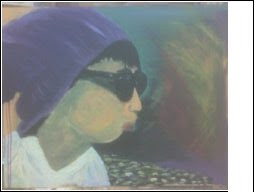 acey and Van Gogh, and straying the most from Veneer, although I did make an effort to try to pinpoint certain details and paint them onto the board. Although very happy with the final product, the colourful, yet dark background, the colour choices, the use of lines to reflect aspects of a message, show/contrast values, or depth, and the use of negative spaces; there are things I would like to improve upon. I would like to be more able to pay attention to the many tiny details on the picture to be able to reflect it back on to the board. By this I mean shapes, or shadings of certain areas. For shapes, I would like the proportions of the face to be closer to perfect (unless I intentionally don't want that) I would also like to be more patient with a brush, so I would be able to paint the smaller details, slowly to get the right shapes, lines, and colours. It seems that temptations always get the better of me. Overall, I believe that this was one of my more favoured works, and I believe that it was a better effort from me in comparison to previous years of art.
This above picture is the final piece, although there were slight lighting problems, this final picture seemed to be able to display most of the colours, without extra lighting that brightens the acey and Van Gogh, and straying the most from Veneer, although I did make an effort to try to pinpoint certain details and paint them onto the board. Although very happy with the final product, the colourful, yet dark background, the colour choices, the use of lines to reflect aspects of a message, show/contrast values, or depth, and the use of negative spaces; there are things I would like to improve upon. I would like to be more able to pay attention to the many tiny details on the picture to be able to reflect it back on to the board. By this I mean shapes, or shadings of certain areas. For shapes, I would like the proportions of the face to be closer to perfect (unless I intentionally don't want that) I would also like to be more patient with a brush, so I would be able to paint the smaller details, slowly to get the right shapes, lines, and colours. It seems that temptations always get the better of me. Overall, I believe that this was one of my more favoured works, and I believe that it was a better effort from me in comparison to previous years of art.
Sunday, November 1, 2009
Self Portrait

For our self portrait of ourselves, I found this to be a very interesting project. I had never really sketched out a picture of myself, or done much sketching in the recent past so it was very exciting.
I had practiced a lot of facial features before attempting the final project. Included in them were the eyes, lips, ears, nose, and muscle drawings. I also practiced proportions of the head with the egg-shaped structure and practiced shading. I found the eyes, muscles, and shading the easier parts of the project. I found the lips and shape of the head to be harder objects to draw. When attempting these drawings, I had used light pencils such as H or Hb to create the basic shape and then I had used darker pencils like 3b's or 4b's to shade it in and darken the picture.
All of this was incorporated into the final piece of the project, a self portrait of ourselves. We had looked at ourselves in the mirror and sketched out ourselves, sometimes being timed - this new approach to practice our proportions was really fun, but it helped me properly define certain proportions of knowing where the eyes, ears, lips, and nose where positioned on the head.
Putting everything into the final piece, we took a picture of ourselves and sketched out the picture. What I had found was that putting all the pieces together was much more difficult than drawing individual sections or parts of the face. Especially drawing myself, from a picture (I never like the outcomes of photos of myself), it seemed much more complex than what we had done before. I had proportions of the face quite distorted in comparison of what I really looked like. I had made a lot of changes before I was able to make things look more in proportion and shaped correctly. I had initially drawn up the circular shape, then added an oval shape to the bottom. However, this was in a 3/4 turned position and the shape was a little off from what it looked like, and it took me a long time to have that figured out. I initially had drawn the eyes, nose, ears, and mouth in once the shape was drawn, but they too were out of proportion. For this project, I had done plenty of erasing and drawing and erasing again. Probably one of the hardest things I've done in art! It took a very long time of trial and error, with help from friends and Ms. Cockburn to actually get the proportions and shape correct.
For shading the picture, I had found this easier than my other parts of the project, I was able to spot dark areas and light areas and actually mirror it on the picture (I thought). I had done shading, then I used my finger to smudge it to blend it better, then I used the kneaded eraser to take parts of unwanted areas out. The kneaded eraser was very important in my shading, as it helped to gradually take pieces of the darker areas out.
Overall, this was a fun, but very difficult project.
Tuesday, May 26, 2009
Shadow Box
Friday, May 8th, 2009:
This was the first day of our shadow box final summative. I had made two initial drawings, one a crossroad with some hills, and a scenic view of a waterfall from a helicopter. Ideas for this came from pictures in magazines. Putting the designs aside, as I could not seem to find a good one, I chose to do the physical labour part of the project, cutting out the rectangles for the shadow box, and cut out 24 cardboard squares and glued things together to make the shadow box.
Then, as I was listening to Stairway to Heaven, I used this song as an inspiration to design my shadowbox. It would incorporate my previous projects such as perspective, renaissance-inspired designs, painting landscapes, taping, and many painting techniques. I had completed about half of it, making a small gate, some clouds, and a curving staircase; it looked very good, however it appeared to me that it was a stereotypical view of a stairway to heaven. It was literally a stairway that goes into the stereotypical view of heaven, being clouds and some bright colours. I liked it, however it did not seem to have something special in it that stood out.
This was a challenging first step. I have never made a shadow box before, and I don’t really know what it may look like. To put a staircase into such a small space (cutouts) may prove to be very difficult. The design of this project is not as easy as I thought because we have to put pictures out in 3D, and I am somewhat doubting how it may turn out. I am also considering drawing up a bridge over troubled water, should a stairway not work.
Tuesday, May 12, 2009
For this class, I had redesigned the gate and spent some parts of it trying to think about how to add to the picture of “heaven”. I could not think of things to add, as it may be good enough to just keep it simple. I made extra cut outs of the stairway, the gate, as well as the clouds and glued it on top of a Mayfair cut out.
I plan to use collage to create the clouds, paint for the gate and the sky, and parallel lines for the staircase, and taping (painting) for the staircase, as it will probably be very difficult to paint such small areas. Also, not appearing on the picture, is the wind. I intend to create stencils of that and put copies of it across the top left corner of the picture plane.
This part of the process was somewhat difficult as I wasn’t sure of how and where to place certain objects that I have in mind and I am not sure if I should add it or not. Currently, the picture is relatively plain. I hope to try to add more into the picture, but by the way I set it up, it seems difficult to add much onto “heaven”.
Thursday, May 14, 2009
For this class, I had finished putting the black Mayfair paper underneath the white paper to give it some weight and thickness. I have also attached it to the frames of my shadow box. I have begun to collage the clouds, and they are nearly finished.
This class has been relatively easy, as the work I have done is mostly manual labour. The collage of the clouds is the toughest part of this class, as it is difficult to find a nice colour that would match the colour of the clouds. Another difficult part is visualizing the whole picture. It seems that the clouds at the moment may not look good, however it may change when it is contrasted beside the sky. For the next class, I hope to finish up my collage, and perhaps start parallel lines on the staircase. I have also cut out the stencil for wind.
That may be the hardest part of the picture, because the source of light is not precise yet. As it is already in the sky, drawing parallel lines for shadows may prove to be quite difficult.
Tuesday, May 19, 2009
On this day, I had spent a long duration of time painting the background. This was one of my more productive classes. I had started by making it all the pale blue, then adding white to the still-wet blue on the top. After that, I added more light colours onto the top half of the picture plane, signalling a perspective of heaven. The whole painting was done wet on wet, so I tried to apply plenty of paint, while adding some water to prevent it from drying too quickly. Then, I had added some light green and yellow onto the top. With these two additions, came violet, orange, and other shades of these colours with hints of white across the sky. At the bottom of the picture plane, I had added some lighter colours, but little in comparison to the top, these including violet, light blue and some white.
After partially completing the painting, I shaded in the staircase. Shading (with use of parallel lines) in the staircase was easier than I had expected, however due to the small area the shading didn’t work out too well as the pencil tended to dull quickly and I couldn’t get the desired neat parallel lines that I had wanted. I did not use a ruler to make it seem more natural.
Finishing the rest of this, I had then added changed around where the cardboard would position itself. Instead of going 3-2-1 (bottom to top), I changed the cardboard pieces to a 5-1, where it would actually work. The 3-2-1 had an extra depth so I had to change around the pieces to get the look I wanted.
Tuesday, May 20, 2009
This was my extra class after school. On this day, I may have
gotten the most amount of work done in one class. I had continued to paint some of the background, and add some touch ups of ultramarine blue into the bottom, to create a larger contrast with the light background. I had also continued painting the background, adding some light violet into the top and some white mixed in water. Playing around with the background, I had also added a small subliminal message in the clouds. With my wind shaped stencil, I had applied it 3 times into the upper left hand corner, each being a different colour.
When I had finished painting the sky, I had spent some time painting the gate. The end result of the gate does not look exactly how I wanted it to look, as it seems to look too colourful. This was a tough part of the project, as I had been doing very tedious work, using a tiny brush to paint very slim lines into the gate. I hate painted it a multitude of colours, making the bars on it a combination of roughly 6 different coloured lines. At the end, I had added extra lines with a black sharpie, vertically and horizontally. The vertical lines were for the sides, which I liked, however my horizontal lines for the “opening” part of the gate did not look too good with all of the light colours on the gate.
With the staircase, it was re-shaded and then re-shaded again except this time I used a sharpie. Using the sharpie gave it much more definitive parallel lines, which made the shadows look much more real. In addition to parallel lines, I had also painted the staircase, making it mainly white, with hints of yellow, orange, and yellow-orange. Here, I used taping to keep the paint contained within each step, as it was very difficult to paint straight lines in such a small space. The clouds were also shifted down to allow the gate to stand on-top of the clouds, rather than inside them.
Thursday, May 21, 2009
For this class, I felt like it was mostly completed, so I tried to play around with the picture that I already had. I had changed up the gate, turning it from a bar-like gate to one that was more of something you would see as an entrance to a garden. I drew one up from scratch, drawing inspiration from an advertisement, it seemed to me that a “garden-like” gate would be more suitable than a barred gate. I have made the gate lighter than the previous one, showing a happier side to heaven. This took some time to draw up, cut out (two, one regular paper, and one Mayfair), and paint. By next class, I hope to outline some of the gate to be able to define it more, as it is difficult to with the paintbrush as the surface area is very small. On the gate, there are also two sets of flowers and a ring of flowers on the top.
Also, I have added an extra 3 squares for depth on the first layer. Now, from the first layer to the second layer, there are 4 squares, and then 5 squares for the third layer. These extra squares help add depth to the staircase.
Due to the first layer being 4 squares above the second layer, the staircase along with the gate continued to fall down as it was too heavy. Beneath the staircase, I put in a small spring-folded paper to keep it standing where it should be. I also added dark colours to the bottom of clouds to show shadows and depth.
Monday, May 4, 2009
Unit 3: Interior or Exterior Perspective Painting

In my perspective painting, I have made a house with renaissance inspired architecture. It is made with acrylic paint.
The overall project was difficult. At first, I had to sketch out the picture using techniques involving vanishing points, horizon lines, and special methods to measure distances (such as pillars). This was relatively difficult at first, however it became easier as the project wore on, starting with boxes to chairs. Sketching my building was tough, as there were two vanishing points, this confused me sometimes on where to point certain lines. The shape of many individual parts of the building were difficult to sketch. Arches were difficult to draw, as the curvature of it never seemed correct for me and the landscape (lawn) was not easy to draw to match the shape of the building (as the vanishing points were moved up).
Painting the picture seemed even more difficult. I had never painted buildings before, and this was totally new to me. The light of the building seemed a little tricky, some areas green-blue, and some a pale orange. To make it more complicated, the light of my sketch was reversed when put onto the canvas, so I had to try to imagine things. Painting the building was quite difficult for me as I have never been able to draw moderately straight lines, and tihs was a critical part of the step. A problem in this involved the openings in the buildings with shadows. They appear to be black from the original picture, however when I applied the black onto the canvas, it showed up very poorly and contrasted the picture too greatly. I tried to adjust by adding some light green and light yellow to the black to make it stand out less.
Something that really helped out was the suggestion given to me to use a larger brush than the tiny one I was using. When I used the tiny brush, it turned out to be to flimsy, not allowing me to draw straight lines, however the thicker brush allowed me to improve this. Also drawing straight lines for me was difficult, and it was suggested that I paint keeping my wrist steady, going up and down to draw a straight line. This helped me a lot to draw straight.
However, I still feel that the painting can still be improved upon on many different areas. First, patience would be much more needed, as I lacked that, forcing me to redo many things over again to maintain a straight line or to stay in boundaries. My sketch was a lot neater than my painting, and painting it was difficult to stay inbetween boundaries as I had used a tiny brush, believing that it would be easier, it turned out to be more difficult.
Tuesday, January 27, 2009
Skateboard Unit 2

Sanding of the Deck:
The sanding of the deck was time consuming, but nonetheless exciting, knowing that we would have a smooth finish as the fruit of our labour. It was very good to practice using the grating and sanding tools, which may also be a good future use. The first stage in the sanding (using the grating tool) was quite difficult. I found it sometimes tough because the grate would get stuck in the board, or it may pull off ridiculously large pieces of the board. I found it easier to sometimes switch directions, which may sometimes help prevent the tearing off of large pieces. For technique, i found it much easier to use long straight strokes to get more out of the board with minimal effort. Using short strokes got much less out and i found short strokes to be less productive (in the sense that it would not be as smooth). I also sanded out the edges so that the board would be more round, and smoother overall. It seemed easier to hold the board tucked underneath your arms to grate the edges.
The second stage of the sanding process involved the use of sandpaper. I started at the 60, the most rugged, to remove the larger and unecesary parts of the board including chips and glue. Sand paper was an even slower process, however much more rewarding, getting smoother with every increase in sandpaper. I had to start off by removing all the glue and chips in the board. This was the most enduring, having to apply an extra amount of pressure to get rid of it. For the 60, most of the time was spent using my hand and sandpaper only. Using the 60, a lot of time was also spent on the sides. When i moved up to the 80, i applied the sandpaper to a (kindof) styrofoam base to cover more of the flat side of the board. Using this, i mostly went with the grain of the board, feeling much easier to go with, rather than agai nst it. This was slightly smoother, and took almost as much off as the 60, but a little more refined. I moved slowly up the ranks of sandpaper not finding them all very effective. I didn't really see too much wood bits come up, so it seemed that they did not work. However, feeling the board you could really feel a difference. I could really see a difference when moving up to the 220 and the 400. Both of these produced lots of fine pieces of wood. They made a dramatic difference, taking away all the tiny deficiencies in the wood. The 400 especially, was very good in making the whole board smooth out. By then, the entire board basically felt like a piece of paper. Overall i thought that i was able to make the board very smooth around the edges and the deck.
The sanding of the deck was time consuming, but nonetheless exciting, knowing that we would have a smooth finish as the fruit of our labour. It was very good to practice using the grating and sanding tools, which may also be a good future use. The first stage in the sanding (using the grating tool) was quite difficult. I found it sometimes tough because the grate would get stuck in the board, or it may pull off ridiculously large pieces of the board. I found it easier to sometimes switch directions, which may sometimes help prevent the tearing off of large pieces. For technique, i found it much easier to use long straight strokes to get more out of the board with minimal effort. Using short strokes got much less out and i found short strokes to be less productive (in the sense that it would not be as smooth). I also sanded out the edges so that the board would be more round, and smoother overall. It seemed easier to hold the board tucked underneath your arms to grate the edges.
The second stage of the sanding process involved the use of sandpaper. I started at the 60, the most rugged, to remove the larger and unecesary parts of the board including chips and glue. Sand paper was an even slower process, however much more rewarding, getting smoother with every increase in sandpaper. I had to start off by removing all the glue and chips in the board. This was the most enduring, having to apply an extra amount of pressure to get rid of it. For the 60, most of the time was spent using my hand and sandpaper only. Using the 60, a lot of time was also spent on the sides. When i moved up to the 80, i applied the sandpaper to a (kindof) styrofoam base to cover more of the flat side of the board. Using this, i mostly went with the grain of the board, feeling much easier to go with, rather than agai
 nst it. This was slightly smoother, and took almost as much off as the 60, but a little more refined. I moved slowly up the ranks of sandpaper not finding them all very effective. I didn't really see too much wood bits come up, so it seemed that they did not work. However, feeling the board you could really feel a difference. I could really see a difference when moving up to the 220 and the 400. Both of these produced lots of fine pieces of wood. They made a dramatic difference, taking away all the tiny deficiencies in the wood. The 400 especially, was very good in making the whole board smooth out. By then, the entire board basically felt like a piece of paper. Overall i thought that i was able to make the board very smooth around the edges and the deck.
The Painting:
This process was a moderately dfficult process. The designing of it in pencil was an interesting process where we could draw on a large variety of inspiration, where I finally went with the idea of a guitar. I spent a good deal of time designing the rest of it, adding flames, an octopus, and other objects to the guitar. The next part was harder, where we had to cut out stencils for the skatseboard. This was my least enjoyed part of the project, because the task was tedious, but the final output was well worth it. The designs were applied to paper first. This was fun, as I was able to experiment with different tones and colours. I was able to try many new designs and eventually get a few designs I liked from the 3 different paintings I did. From this, I also developed a few more stencil designs, including the peace symbol, curve-design, and squares.
Then it was time to make a final. I put all my favourite designs together, and applied it to another sheet of paper. This included a blue-white background, the V-shaped guitar(black and white), orange peace symbols, flames, and had nearly perfected the technique by using the sponge.
After completing the paper copy. I moved onto the real skateboard. I had designed the whole thing with extreme caution, making sure that I did not screw up on the final - after so many trials. I had done everything, but left out the detailed designs such as the flames, octopus, and waves. I felt that the plain black and white guitar (with a brown neck) looked better without the designs. I felt that I had complicated some things with all the extra designs and it did not look as good. Keeping it simple made the guitar turn out better and have the middle stand out.
Subscribe to:
Posts (Atom)