
The portrait painting is the follow up of the self-portrait sketch. Here, I chose a picture portraying me with a hat and sunglasses. The particular picture of myself was chosen for a reason, as it was a unique picture. Many 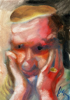 of the self portraits entirely reveal the facial features of the artist. I was looking for a change, where parts of the face may have
 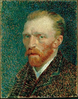 been covered up. The particular picture also contained a very uniquely coloured hat, a bright violet, which greatly contrasted the surroundings of the picture. I imagined that this would really stand out within a painting, and help display the other features of the face.
 of the self portraits entirely reveal the facial features of the artist. I was looking for a change, where parts of the face may have
  been covered up. The particular picture also contained a very uniquely coloured hat, a bright violet, which greatly contrasted the surroundings of the picture. I imagined that this would really stand out within a painting, and help display the other features of the face.
There were a few artists who had helped inspire the work. Van Gogh, Johannes Vermeer, and Dan Lacey(right). Van Gogh's work uses plenty of tiny brush strokes in his artwork, making his self portrait seem like a reflection of himself. I really enjoy this style, not only for its aesthetic beauty, but it also moves your eyes around the picture plane. This served as an influence to how I may create my background, and to perhaps use his style of painting in my work. In the end, I chose to incoroporate some of this short stroke technique, to try to make the impression that I may be in some sort of reflection of water. Vermeer served as a totally different example for my work. Johannes' work is much more fine, and usually is a solid brush stroke, with blending. I could not hope to try to emulate Vermeer's work, (that would require many more years of practice), however I really enjoyed how the face and clothing was done, and how the gradual
 blending really helped to show the shadows on the person. This work encouraged me to blend colours very gradually using a wet-on-wet technique to achieve certain tones. Dan Lacey's work was a large influence for my work. It was very enjoyable, and vague, with a certain degree of randomness(with all of his pancakes), that really made me enjoy his work. His work helped me develop how the colours would interact with each other on my self portrait.
 For this acrylic painting, I wanted to exclude the background, and so I initially threw paint randomly onto the board (canvas?), and then I had tried to sketch out the proportions with a pencil over the dried paint. I had realized after applying the background that it may be very difficult to get the correct shapes, since I had troubles with that in my initial sketch (for previous project).
 The background was mostly long dry-brush strokes, with the left side lighter, and the right side darker. This was a quick decision, which I had done after noticing how the values on my face were done. I tried to contrast the darker side (my left side of the face with my hat) with lighter values, and the lighter side (right) with darker values.
 I was not sure of how I wanted to create my face, although I wanted to create a kind of blurry, blended portrait, like that of Lacey's and Van Gogh's work. For my background, I only planned out how the values may work out, however I did not decide on exactly what I wanted, so I chose to just play around with what I had. There were no very clear intentions on what the mood may be, although I aimed for it to look relatively calm, like many self portraits I have seen.
As the portrait took shape, I was quite a blur, and shapes were not very defined, so I tried to work more in the direction of Vermeer and 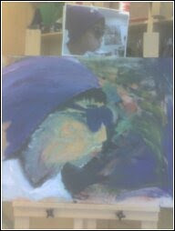 Van Gogh. This seemed to evoke some sense of speed and confusion, and it was interesting, however I wanted a more defined image. Much of the original worked with dry brush strokes that created some background and shape, which then followed by larger 'globs' of paint to fill in the spaces. For the blending of the facial features, I found that applying little paint intially, followed by using a large, wet, clean brush to go over the initial paint really helped to gradually smooth out the features.
On the board, I tried to leave some negative space (showing the board
itself), to try and give some room for the eyes to rest. However, as the project wore on, much of this was covered up (but there is still some left). Now, shape begins to develop, my chin becomes more defined, my nose is pushed out, and lips are drawn up. My glasses really took shape only after Charlie noticed that they were too circular, and that they needed to be lengthened, and
 Van Gogh. This seemed to evoke some sense of speed and confusion, and it was interesting, however I wanted a more defined image. Much of the original worked with dry brush strokes that created some background and shape, which then followed by larger 'globs' of paint to fill in the spaces. For the blending of the facial features, I found that applying little paint intially, followed by using a large, wet, clean brush to go over the initial paint really helped to gradually smooth out the features.
On the board, I tried to leave some negative space (showing the board
itself), to try and give some room for the eyes to rest. However, as the project wore on, much of this was covered up (but there is still some left). Now, shape begins to develop, my chin becomes more defined, my nose is pushed out, and lips are drawn up. My glasses really took shape only after Charlie noticed that they were too circular, and that they needed to be lengthened, and

nded some blue into the peach colour, and painted it in, however it proved to be too dark, so gradually each class I would apply a layer of a very wet and thin peach tone to lighten it up.

For this painting, as I said earlier, had no real idea of exactly where it was going. There was no expression, or message initially planned out, however in my mind I did want a relatively calm, tranquil, yet lively painting. However, I do realize in my mind, as I'm writing this, that as I am working on it, I didn't want something extremely calm, and formal, like portraits of prime ministers. I wanted some action, and some movement on the picture plane. This is reflected by the random background, which serves to move the eye around with its many warm and cool colours in many shapes and directions. The lines on the face reflect many feelings of action, and a sense of confidence and calmness with the glasses. Achieving the feelings of action required movement, and that was done witht the line work, where lines on the background guide your eye from the top of the face to the bottom of the face. Lines in the hat, neck, shirt, and cheek also help provide this movement.
My overall message was to show a relative calmness, while keeping it casual, lively, and imagination. Looking into the background, this was on-the-go, meaning that there was little to no planning involved, and it was supposed to show a degree of randomness, and imagination. The Van Gogh-like short brush stroke technique at the bottom was done to create a feeling of looking into a reflection - for self reflection, thoughts, or thinking. The space-like background serves as the landscape.
The light tones on the face and shirt are equal in terms of quantity with the amount of darker tones in the shadows, hair, and glasses. This seems to even out the mood of the painting, making it neither happy, nor sad, but very neutral with hints of livelyness that seem to come out of the brilliant violet hat and the mixed background. The blues on the shirt give it a wrink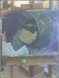 ly feel, almost as if being blown, yet again suggesting feelings of action. The background gives an imaginary feel, as if you could just stare into space and think. The spiral lines in the cheek help evoke this imaginary feel, making it seem like as if it would last an eternity. The left side was left to appear like the wooden panel we used to seem like negative space for the eye to rest. The middle ground, much of it hidden, is behind the face and hat that can be seen. Much of it includes the original colours used to shape out the face, as well as the pencil markings to outline it. The white on the shirt serves as a base colour for the shirt, a light tone, giving the painting an airy, happier feel to it. The face is mostly a light peach, or orange colour that is covered by more layers of peach and/or orange, blue, green, and violet. This light value contributes to the calm, lively message that the painting displays. The foreground consists of things like the hat, the glasses, shadows, and the facial features. The hat displays a bright purple that stands out, showing the lively parts of the painting, while the hair beneath it contrasts it significantly to allow for it to stand out. The shadows on the shirt, neck, and face help show where the light comes from, gives it an almost outdoor feel, which contradicts the "spacey" feeling received from the background- giving the picture a confusing, random feel.
 ly feel, almost as if being blown, yet again suggesting feelings of action. The background gives an imaginary feel, as if you could just stare into space and think. The spiral lines in the cheek help evoke this imaginary feel, making it seem like as if it would last an eternity. The left side was left to appear like the wooden panel we used to seem like negative space for the eye to rest. The middle ground, much of it hidden, is behind the face and hat that can be seen. Much of it includes the original colours used to shape out the face, as well as the pencil markings to outline it. The white on the shirt serves as a base colour for the shirt, a light tone, giving the painting an airy, happier feel to it. The face is mostly a light peach, or orange colour that is covered by more layers of peach and/or orange, blue, green, and violet. This light value contributes to the calm, lively message that the painting displays. The foreground consists of things like the hat, the glasses, shadows, and the facial features. The hat displays a bright purple that stands out, showing the lively parts of the painting, while the hair beneath it contrasts it significantly to allow for it to stand out. The shadows on the shirt, neck, and face help show where the light comes from, gives it an almost outdoor feel, which contradicts the "spacey" feeling received from the background- giving the picture a confusing, random feel.
 This acrylic painting project overall, was not as difficult as the previous sketch. I feel very good about how the self portrait turned out. I allowed my self to be able to pay less attention to detail by selecting this picture, by not needing to paint the eyes, which may have been much harder to paint than to sketch. It seemed to get easier, and be a lot of fun, once I had a general shape of the head. The begining seemed the hardest, as painting (for me) is harder to get very fine details, and create a general shape. Once the proportions, and shapes seemed in line, then it was just a matter of shading in and painting what needed to be painted. When this was painted, the background was also covered with a gesso layer that helps provide a shiny type of effect. Also, as I finished up the entire painting, standing really far away, and holding a camera; I realized that the skin tone was too bright of an orange. I had already gradually toned down the orange to a more lighter, more peach colour using a wet brush to go over the dry paint.
The confusion, thought, action, and livelyness that is seemingly displayed in the painting reflect my current state with life in school, and outside school. From the original 3 artists chosen as influences or encouragement for my work, my final product seems to be a combination of L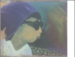 acey and Van Gogh, and straying the most from Veneer, although I did make an effort to try to pinpoint certain details and paint them onto the board. Although very happy with the final product, the colourful, yet dark background, the colour choices, the use of lines to reflect aspects of a message, show/contrast values, or depth, and the use of negative spaces; there are things I would like to improve upon. I would like to be more able to pay attention to the many tiny details on the picture to be able to reflect it back on to the board. By this I mean shapes, or shadings of certain areas. For shapes, I would like the proportions of the face to be closer to perfect (unless I intentionally don't want that) I would also like to be more patient with a brush, so I would be able to paint the smaller details, slowly to get the right shapes, lines, and colours. It seems that temptations always get the better of me. Overall, I believe that this was one of my more favoured works, and I believe that it was a better effort from me in comparison to previous years of art.
This above picture is the final piece, although there were slight lighting problems, this final picture seemed to be able to display most of the colours, without extra lighting that brightens the acey and Van Gogh, and straying the most from Veneer, although I did make an effort to try to pinpoint certain details and paint them onto the board. Although very happy with the final product, the colourful, yet dark background, the colour choices, the use of lines to reflect aspects of a message, show/contrast values, or depth, and the use of negative spaces; there are things I would like to improve upon. I would like to be more able to pay attention to the many tiny details on the picture to be able to reflect it back on to the board. By this I mean shapes, or shadings of certain areas. For shapes, I would like the proportions of the face to be closer to perfect (unless I intentionally don't want that) I would also like to be more patient with a brush, so I would be able to paint the smaller details, slowly to get the right shapes, lines, and colours. It seems that temptations always get the better of me. Overall, I believe that this was one of my more favoured works, and I believe that it was a better effort from me in comparison to previous years of art.
No comments:
Post a Comment